JACOBIN
A visual language for the left
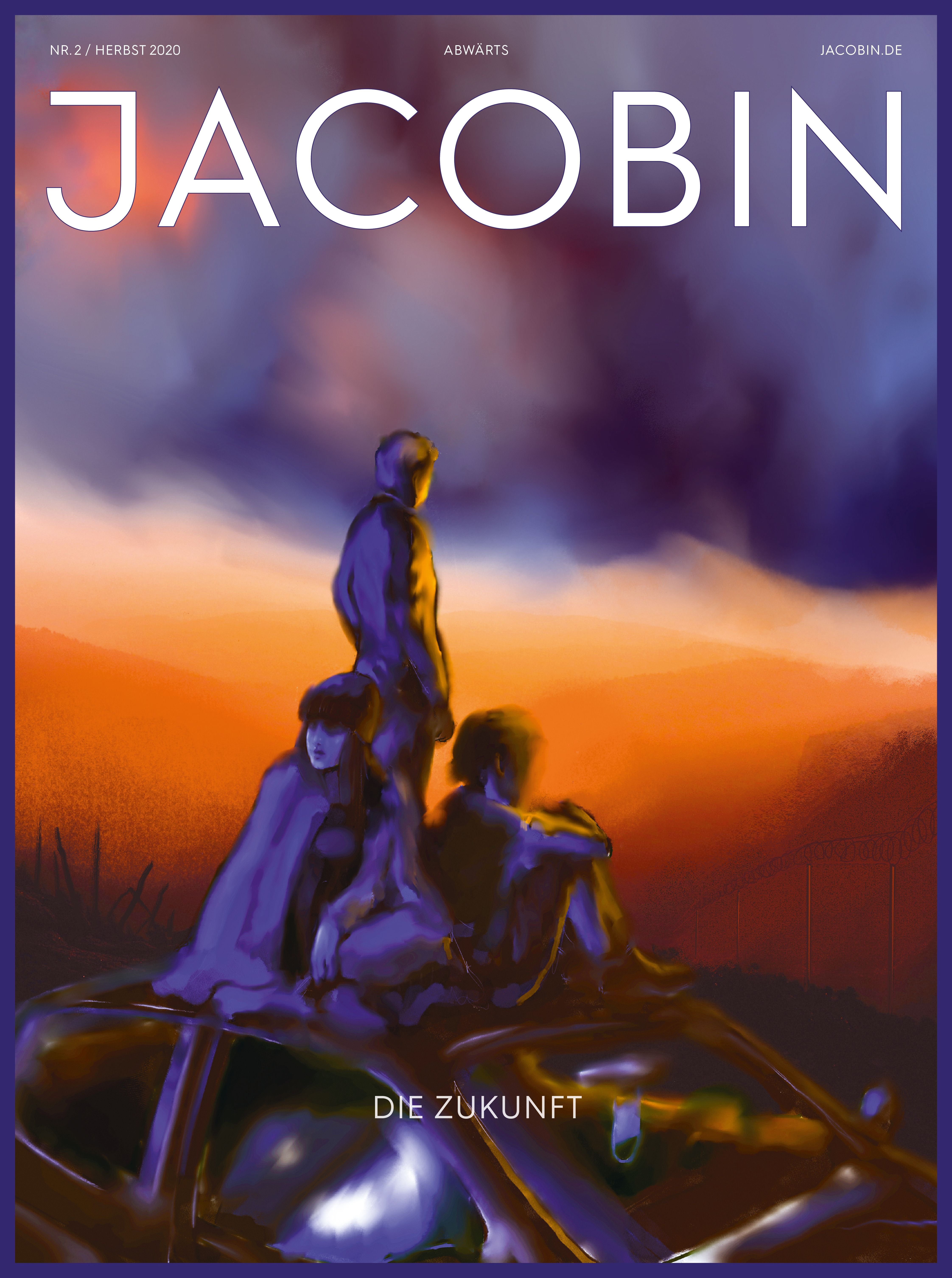

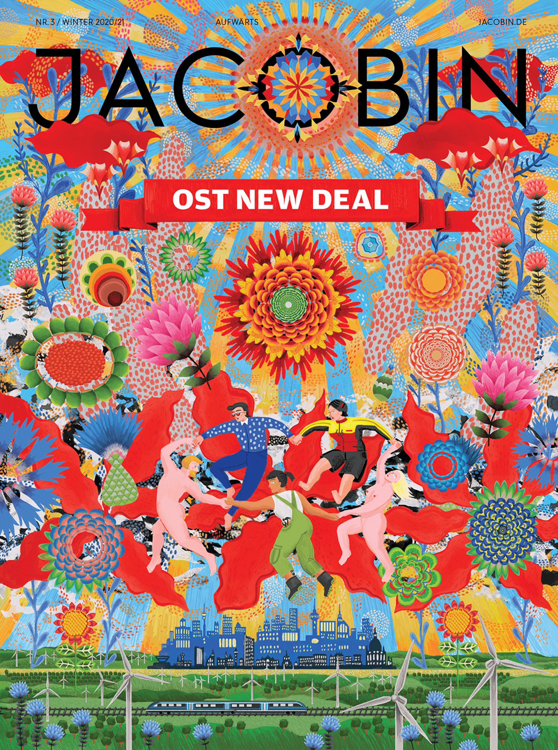

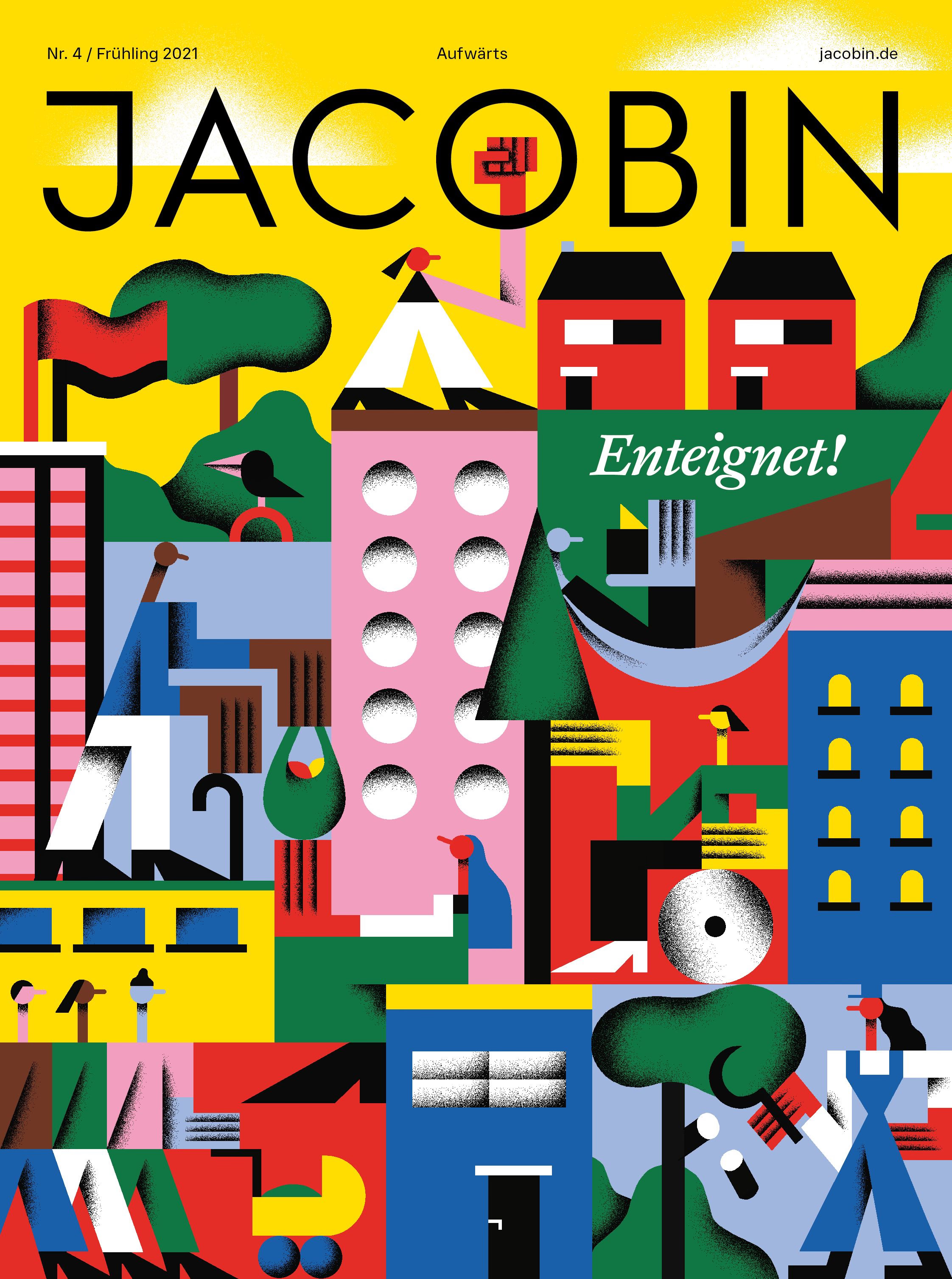

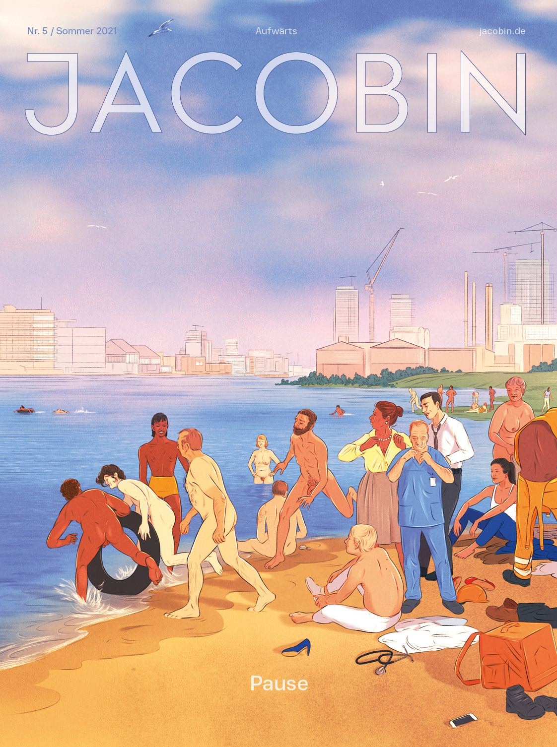

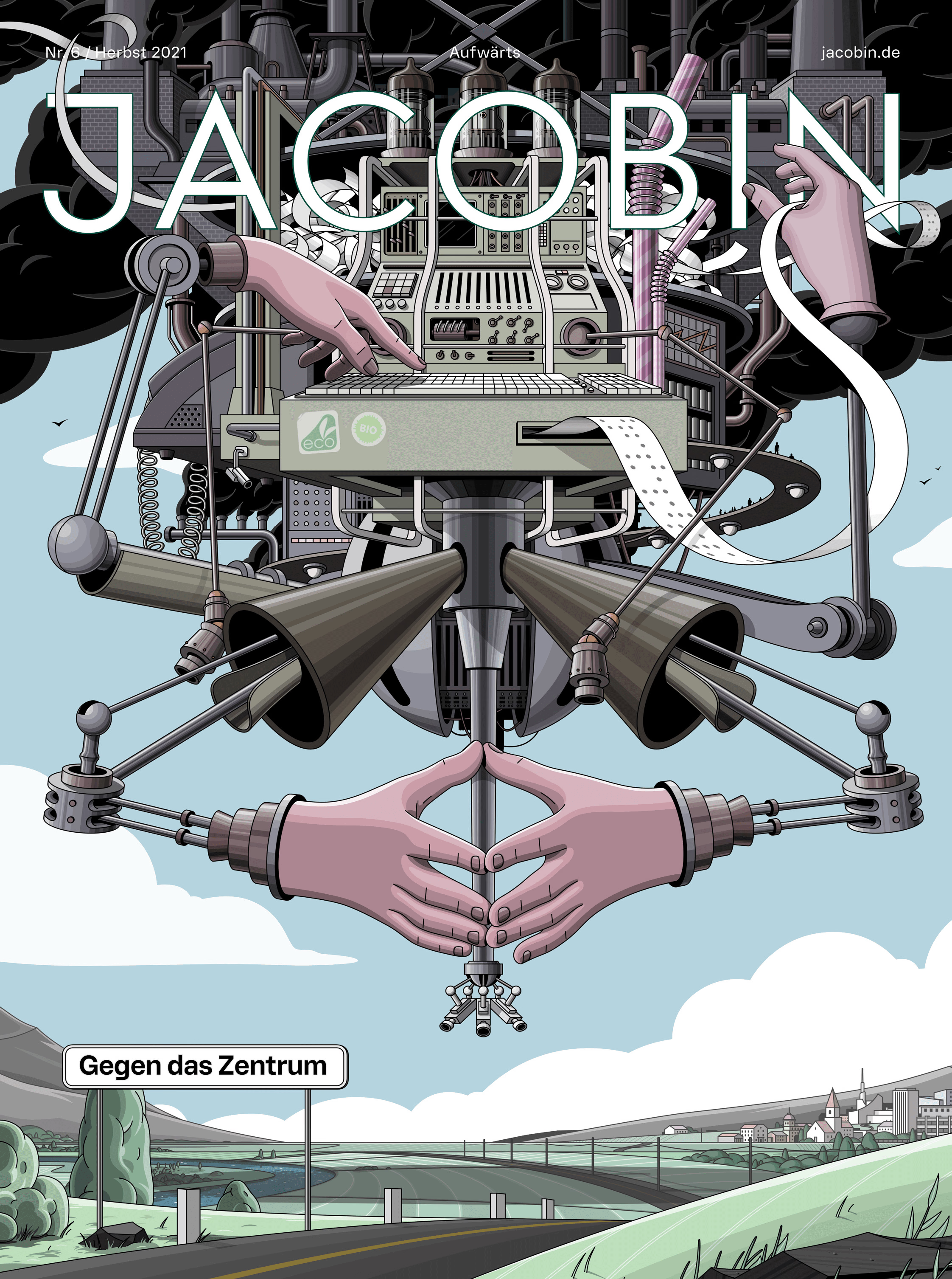

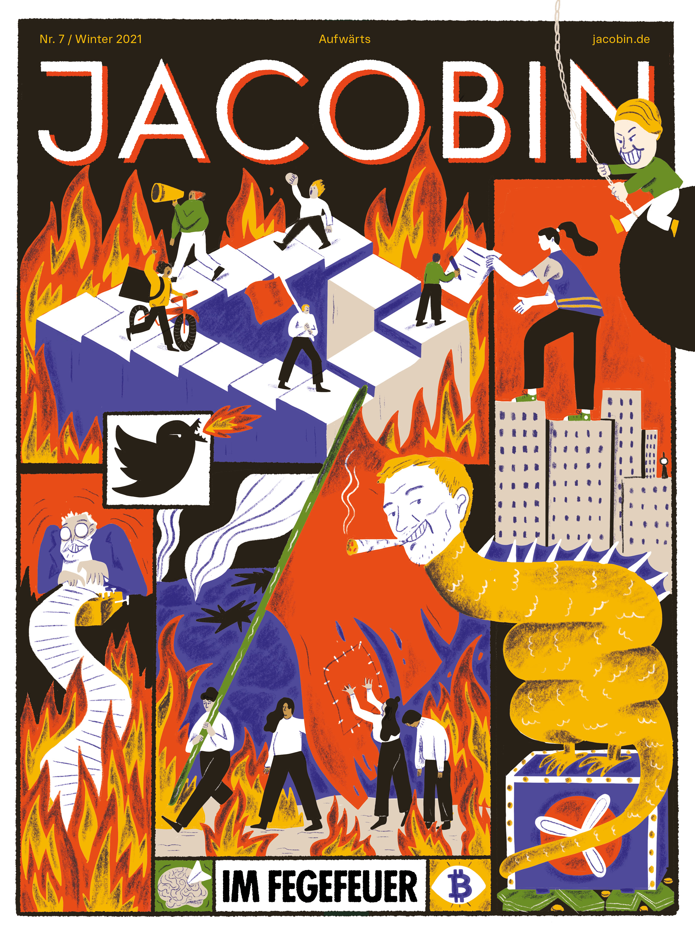

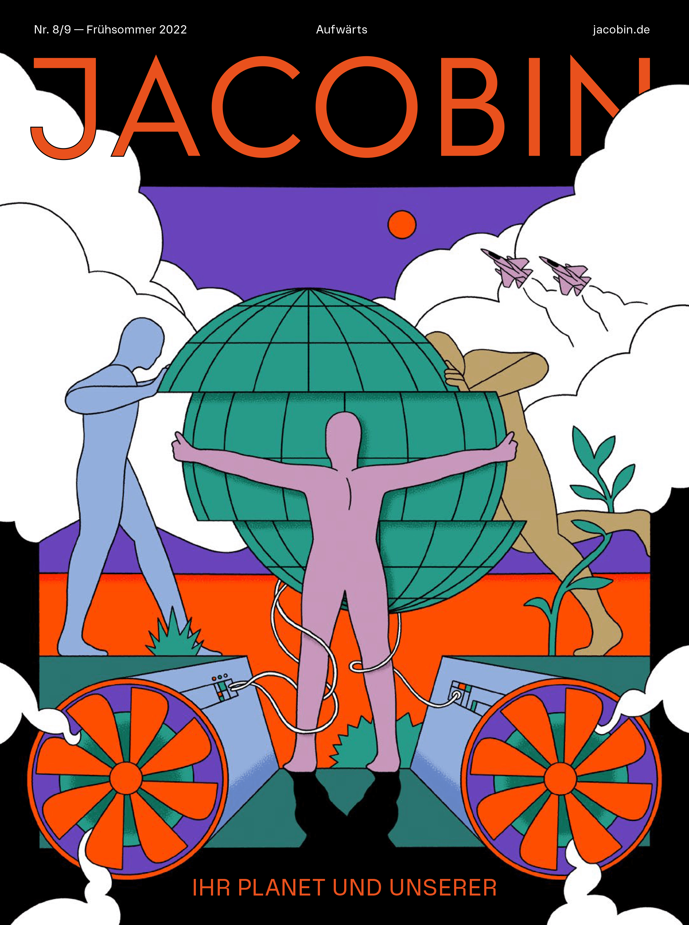

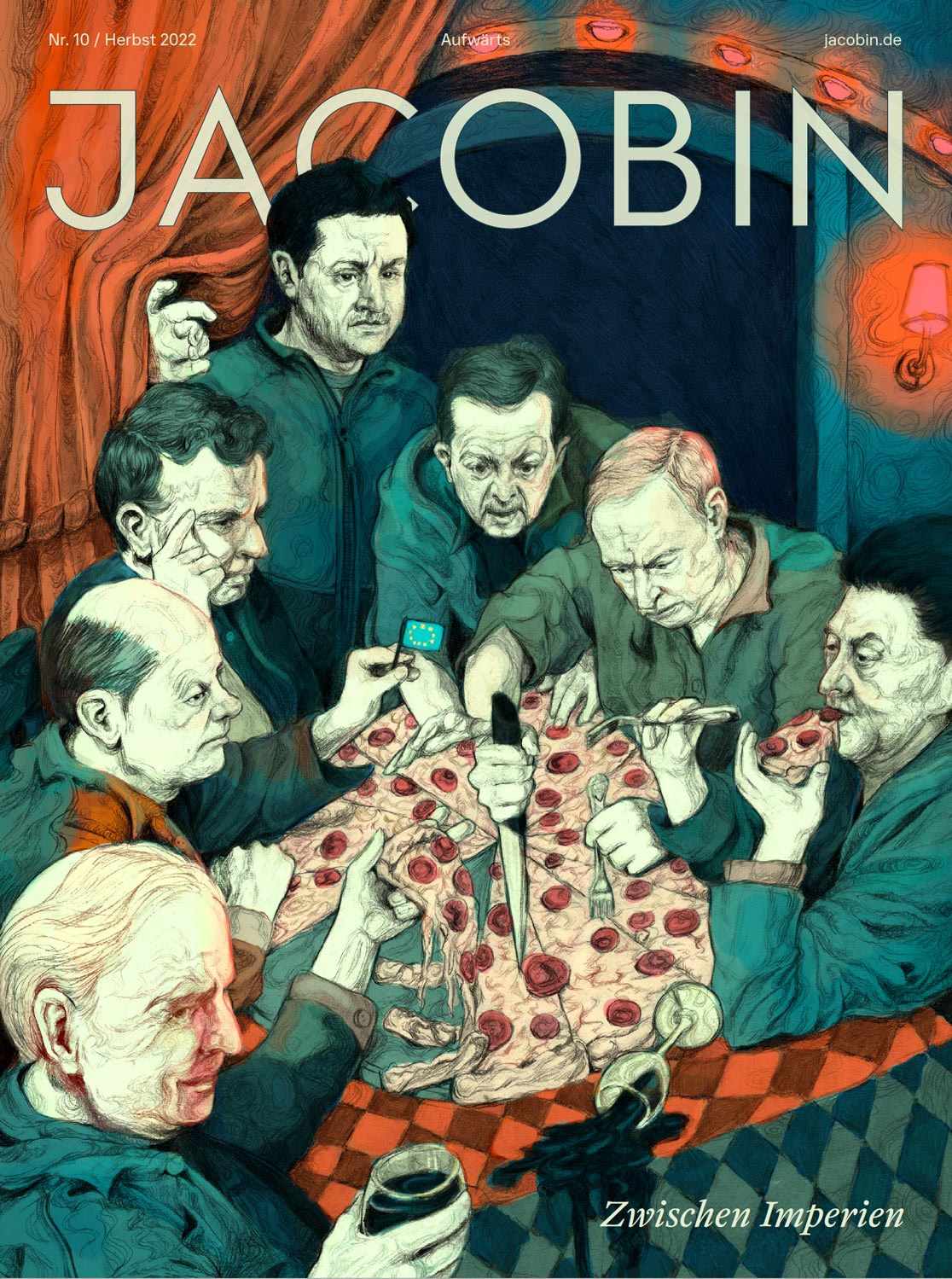

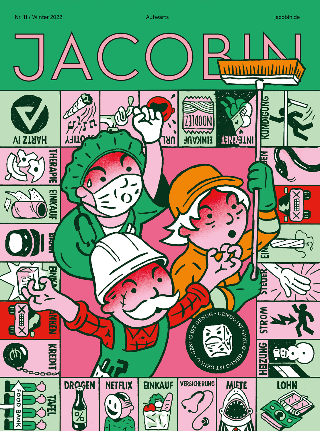

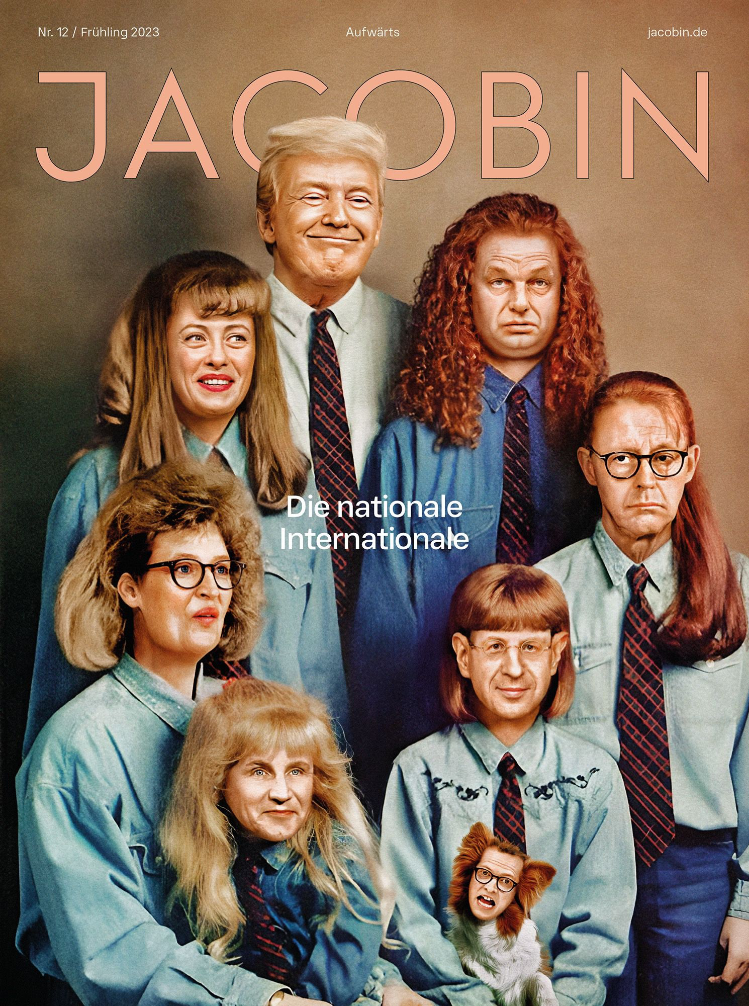

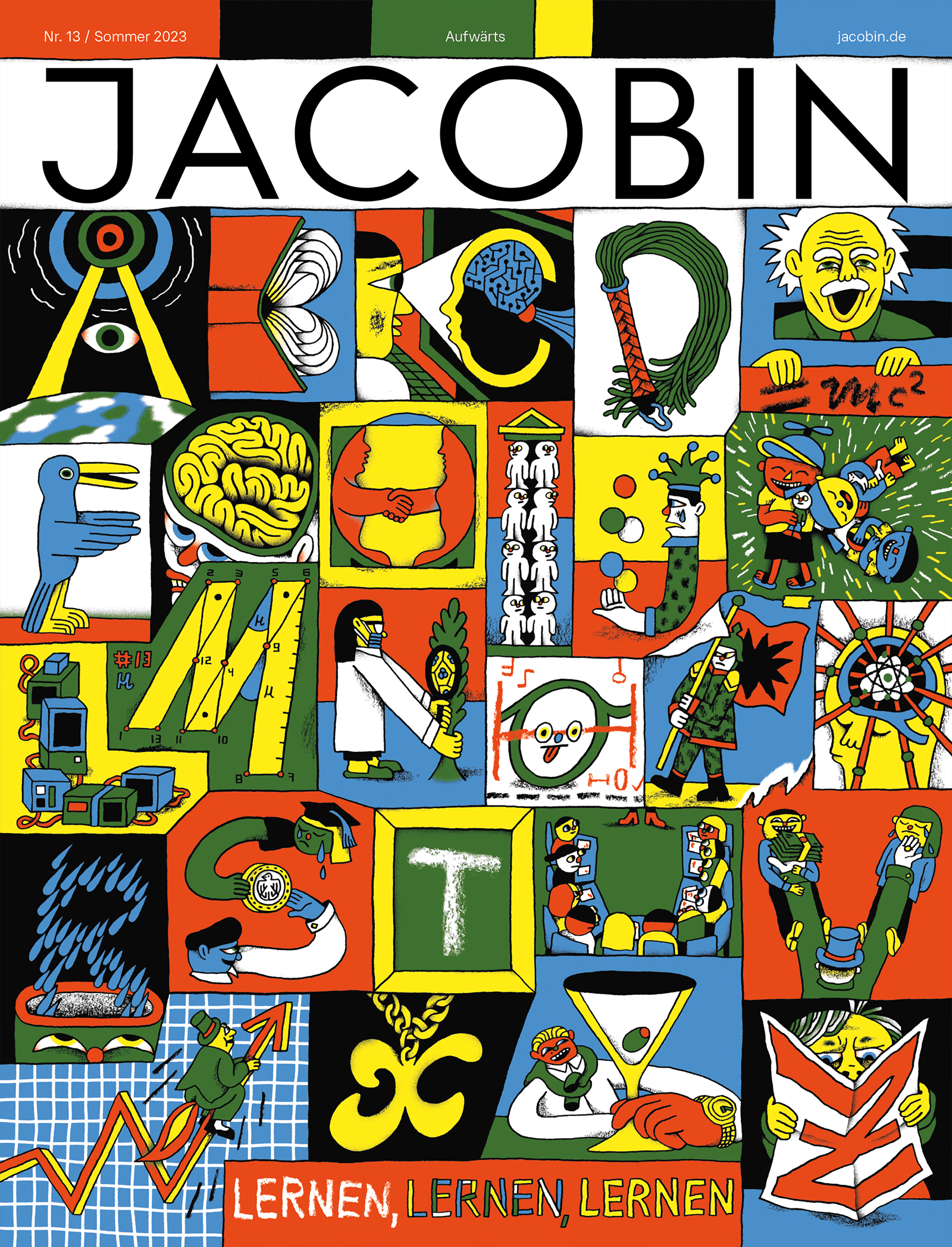

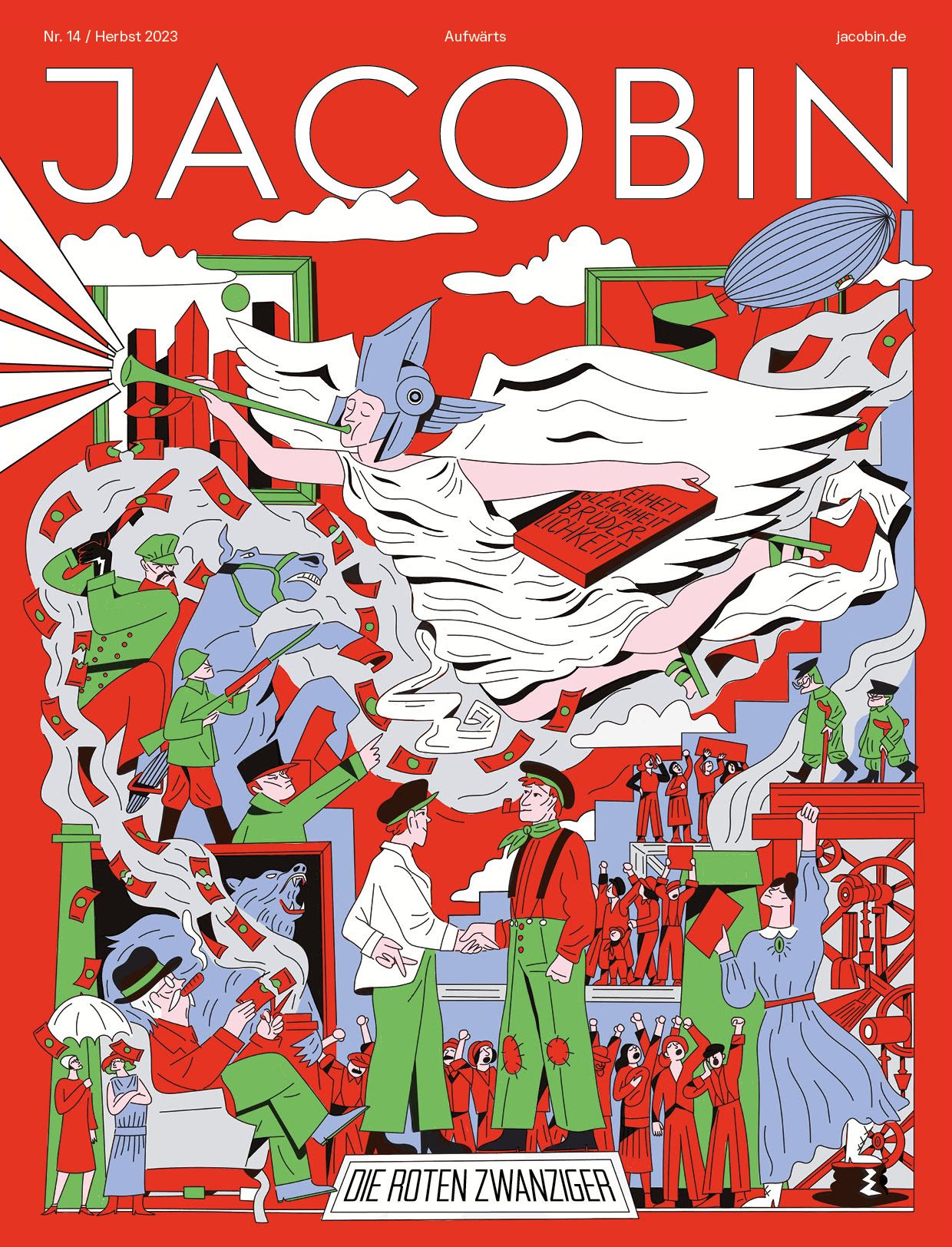

As co-founder and Creative Director of the German edition of JACOBIN, I spent four years building a magazine and publishing house that gave contemporary left-wing politics in Germany a visual language it had been missing for decades.
| Year | 2020-2024 |
|---|---|
| Categories | Magazine, Branding, Website |
| Awards | German Design Award 2025European Newspaper Award 2024 |
| Collaborators | Andy King ↗ (opens in a new tab), Julius Klaus ↗ (opens in a new tab), Marie Schwab ↗ (opens in a new tab), Markus Stumpf ↗ (opens in a new tab), Rory Witt ↗ (opens in a new tab), Zane Zlemeša ↗ (opens in a new tab) |
| Special thanks | To the co-founders of Brumaire publishing house, the editorial staff and all designers and illustrators, who joined the project |
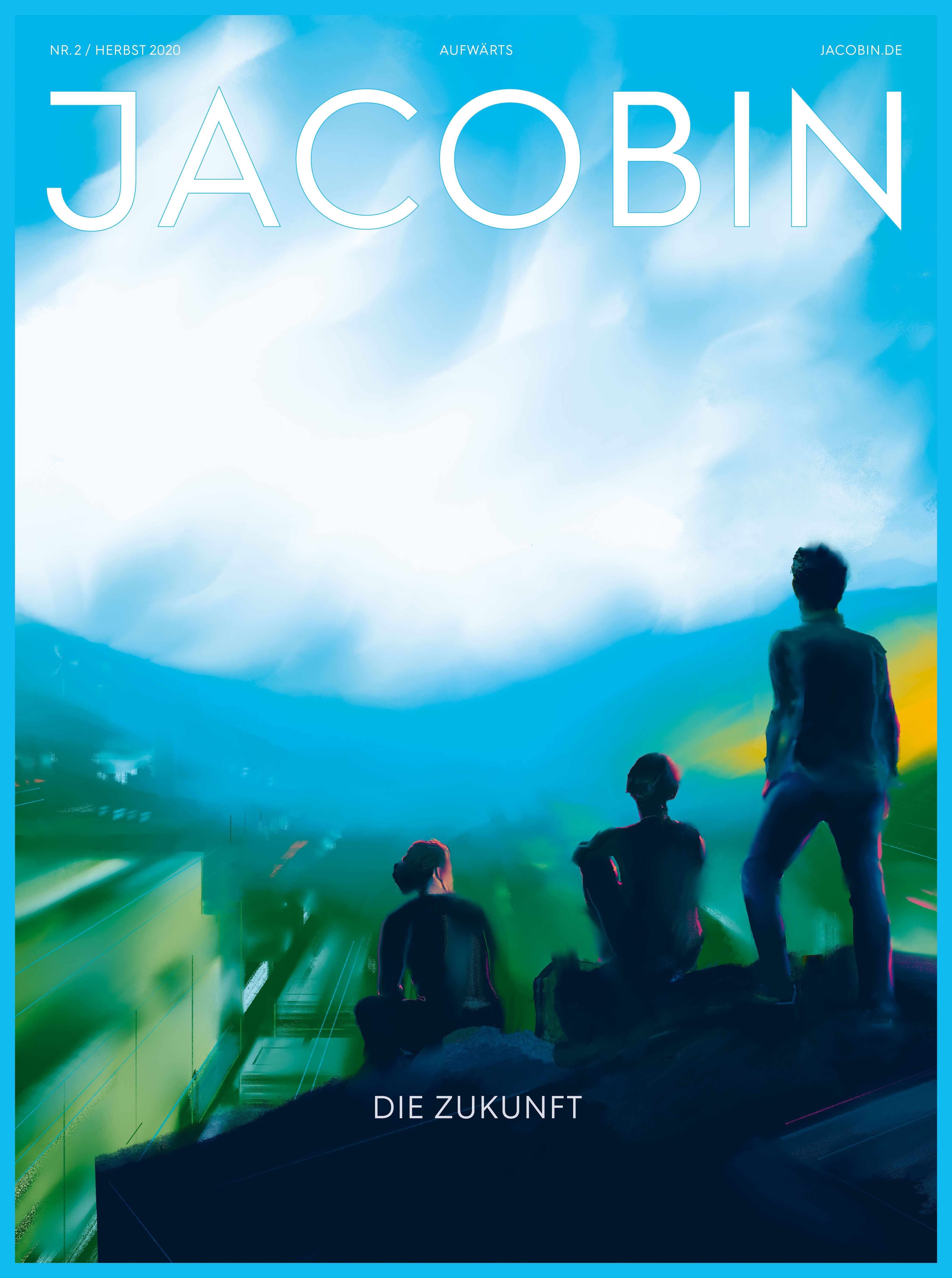



Issue #2. Fall 2021. Tête-bêche format. Illustration: Andreas Faust
What began as an experiment grew into a widely acclaimed political publication whose visual ambition shaped how a young generation of activists saw the left. The US magazine JACOBIN was already known for its iconic cover illustrations and bold visual style: a sensibility that, at the time, almost no one associated with contemporary progressive movements. So when my friend Ole Rauch first floated the idea of a German edition in 2020, I was struck by the prospect of reimagining their radical approach to design for an audience here. With next to no budget, but highly motivated and with complete creative freedom, we got to work.
In an era of economic decline, ecological disaster and the resurgence of authoritarianism, social-democratic and socialist ideas could be more powerful than ever, yet they suffered from a crisis of substance and representation. Failed parties, tamed unions, far right dominance over social media, and established progressive media, that looked and read like stale bread. We belonged instead to a new generation of socialists, less interested in party lines or ideological schools, eager to leave the old baggage behind and find new answers to the pressing questions of our time. It was a melting pot of young economists fighting to reclaim the economic narrative, aspiring freelance journalists sick of corporate media, and climate activists, all searching for new and adequate forms of expression.

My first task was to design and program the magazine’s website, our primary sales platform, where we published a free original or translated article every day as well as made our print issues digitally available. I chose a distinctive typographic mixture that set us apart from every other German media outlet: The 90s staple ITC Garamond Condensed gave the headlines a graceful, distinctly literary feel — a period face that read as current rather than nostalgic. The body text was carried by the free font EB Garamond with its slightly skeuomorphic feel. All combined with the brutal geometric sans of the US edition.
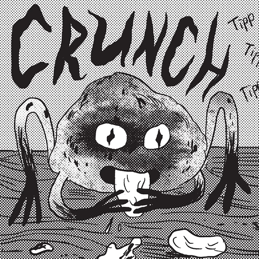
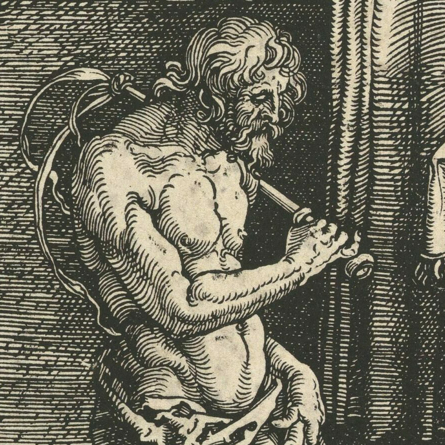
Because I was almost entirely absorbed by the digital side, the first print issue was designed in full by a team of students from Stuttgart. For the next two issues I took over the cover design — drawing the second cover myself — and assembled a team of professional graphic designers, all friends who joined for the fun of it and for the movement. From issue #4 onward, this team took over the magazine entirely, and we redesigned it from the ground up. Within a basic design framework, we prioritised creative freedom, developing a dedicated layout or illustration style for each individual article. We also brought in dozens of external illustrators and designers — friends or colleagues whose work we admired. Across the publishing house and the magazine, I was responsible for everything visual. My concept and directive were to make JACOBIN a melting pot for all kinds of young graphic designers and illustrators as well. During my studies and career, I met so many young (semi-)politicised left-leaning folks who all saw the gap in representation and had ideas about how to fill it through their crafts. So my mission was to give them the opportunity to experiment and to be published in a high-profile print magazine.
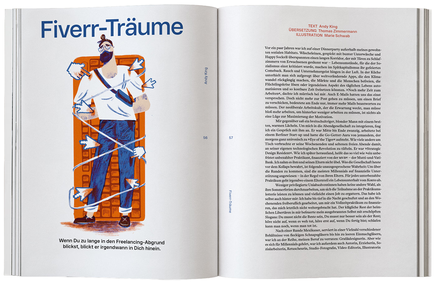

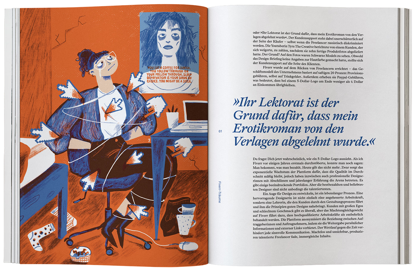

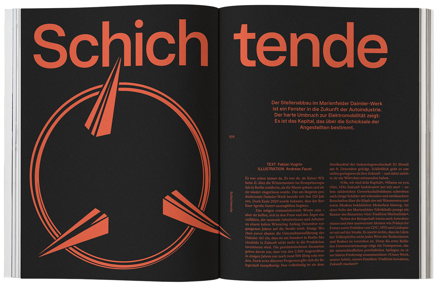

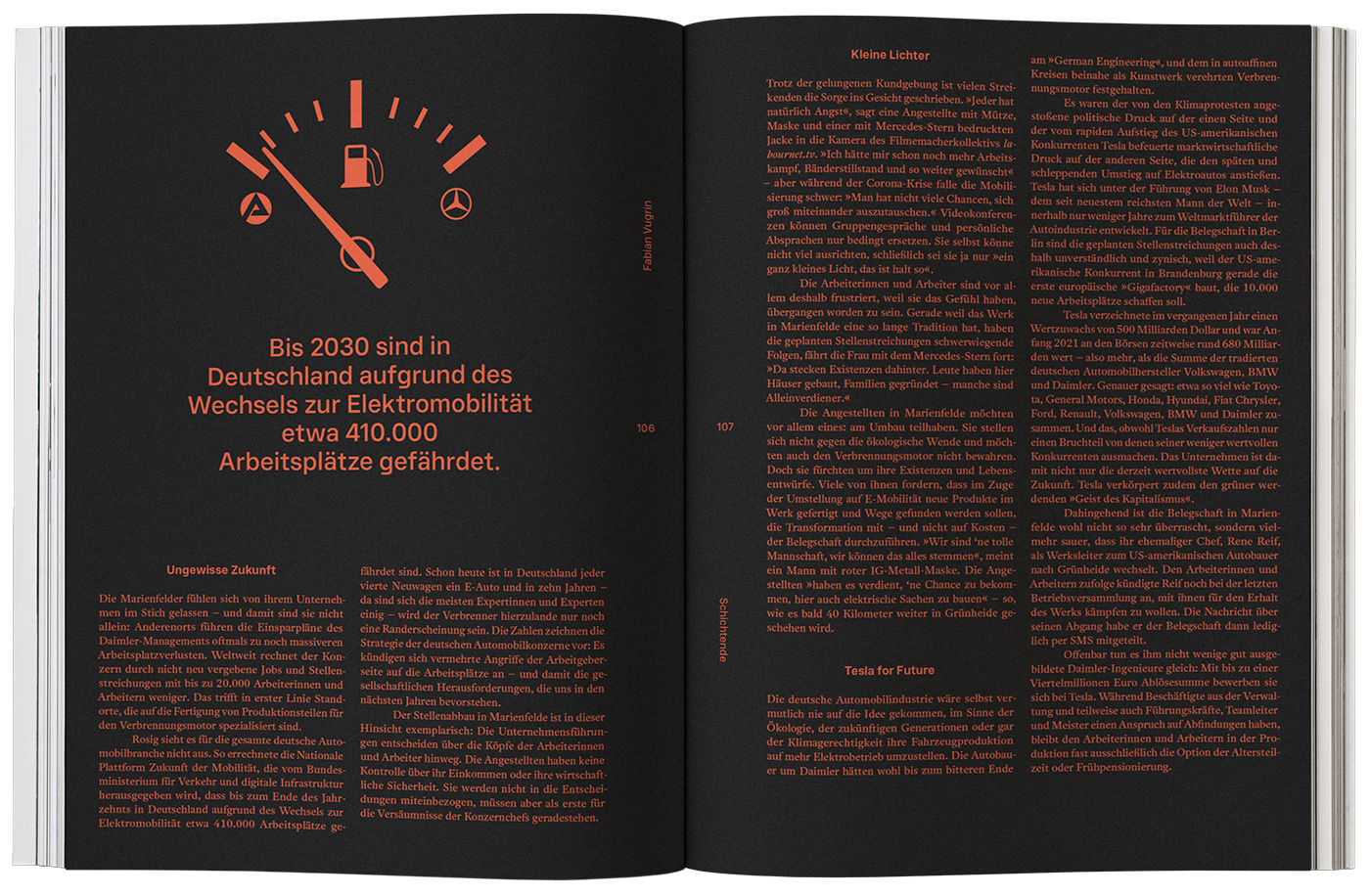

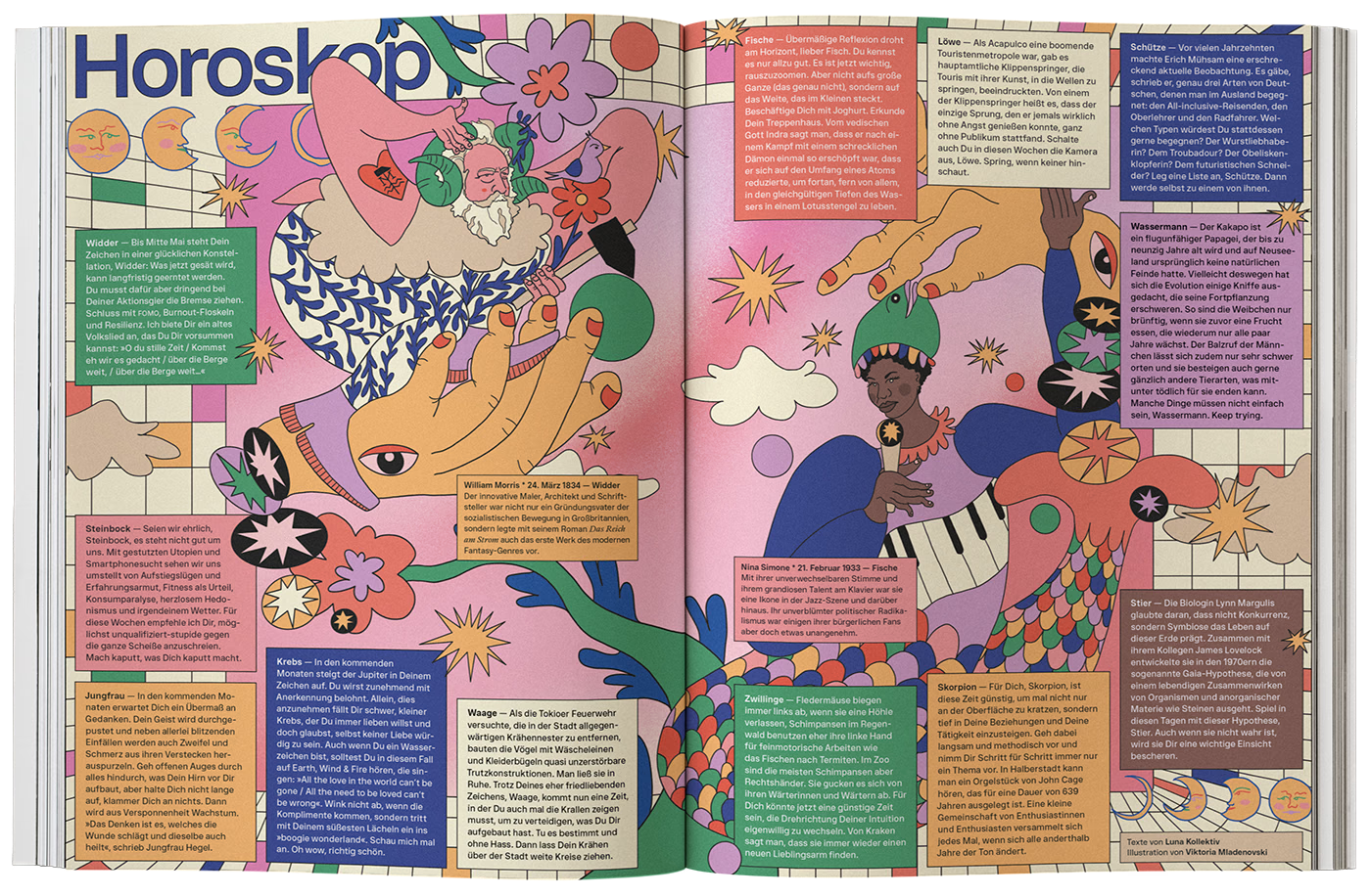

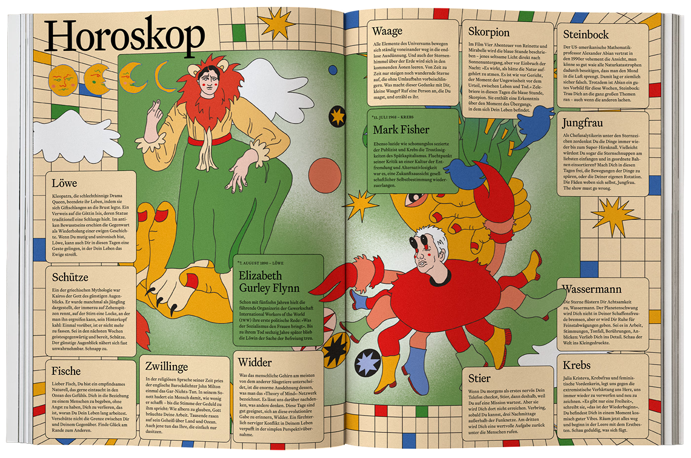

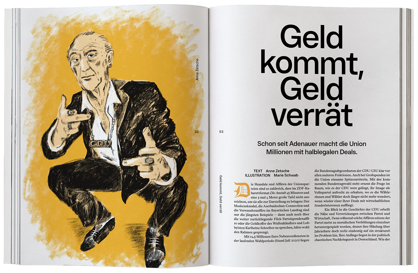

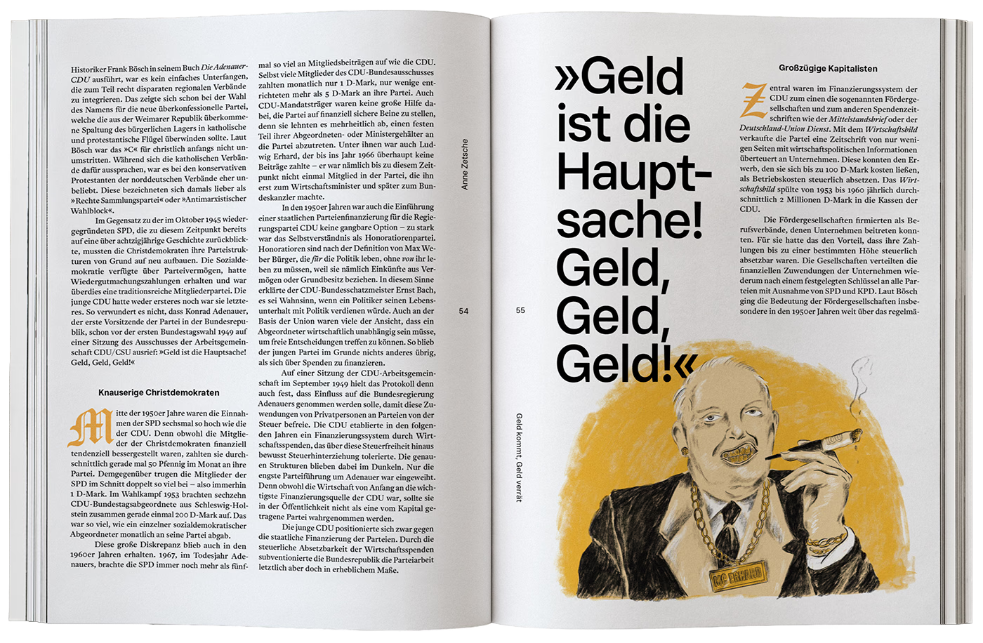

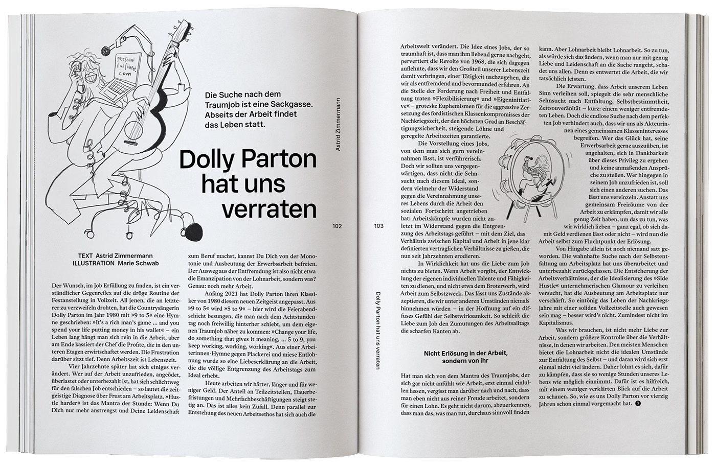

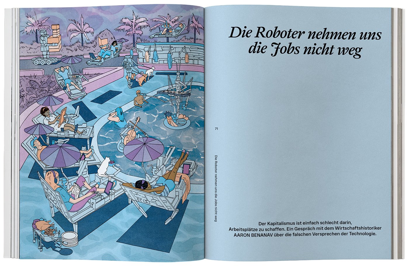

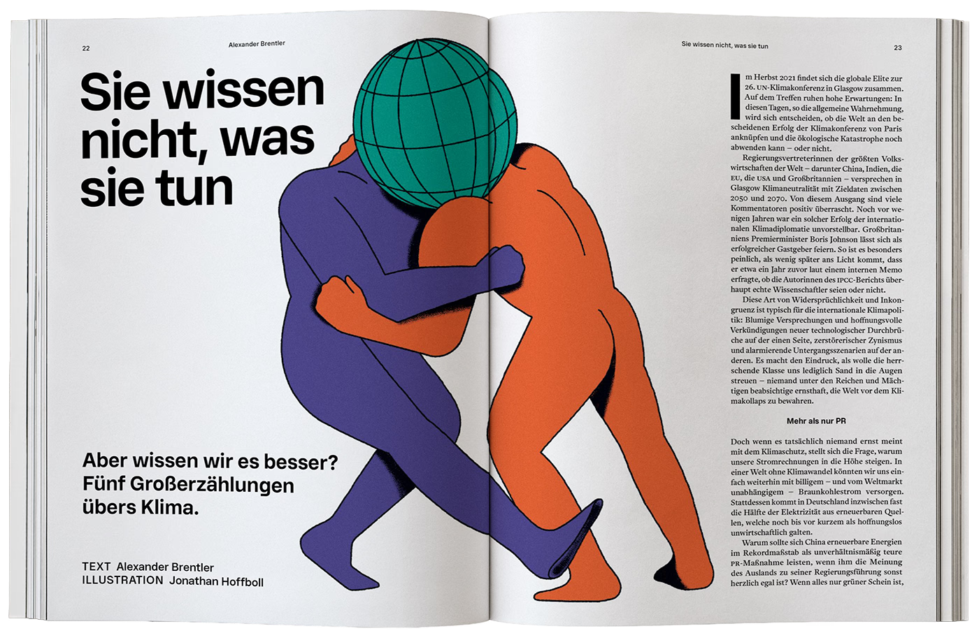

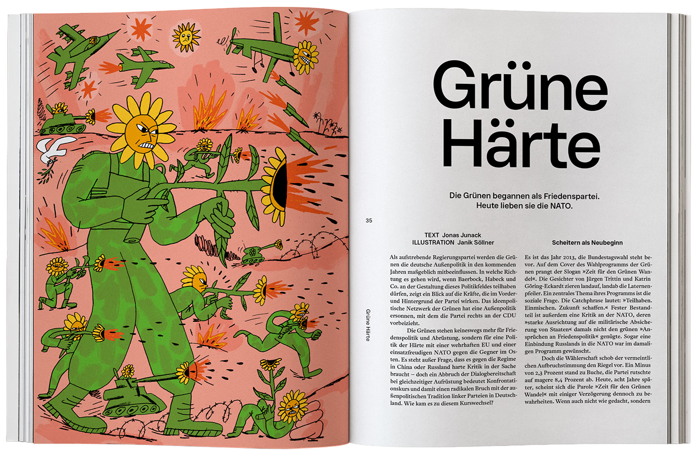

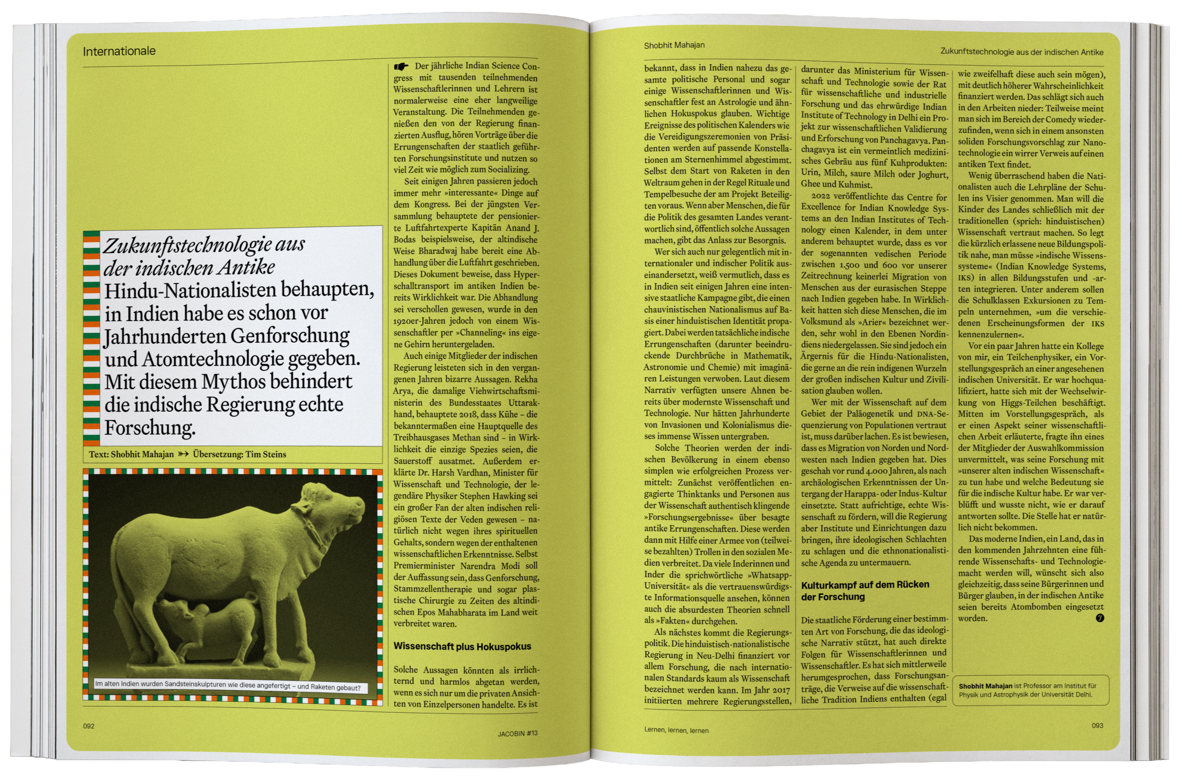

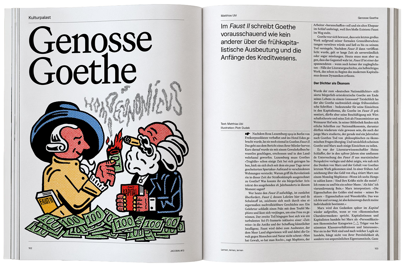

Various pages from the magazine from different designers and illustrators. Both in the old and new design framework.
Coming up with motifs, concepts and ideas was a central part of my job, as was being a sparring partner to my colleagues. All the while I was working on my own designs and serving as the main link to the editorial staff. From the US edition we took the focus on illustration, because this medium forces interpretation and imagination, but the magazine design and editorial work were completely independent. My aspiration was to retell, reinterpret, question every article on the visual level, making the graphics an independent voice that intrigues and challenges the reader intellectually just as much as the written word.
No other German political magazine invested so much thought and effort in graphic design as we did, sustained largely by the activist energy of dozens of enormously talented people. The approach was recognised with a German Design Award and a European Newspaper Award.
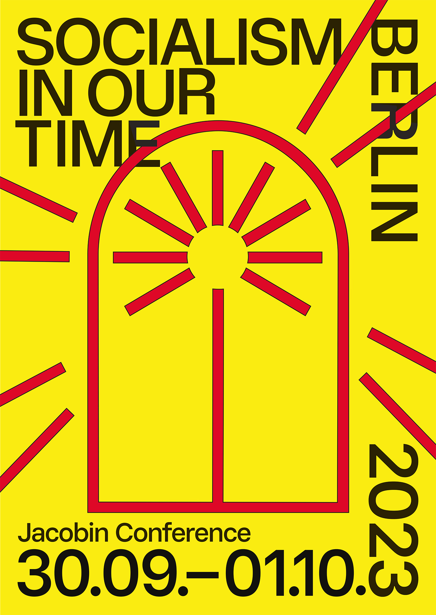

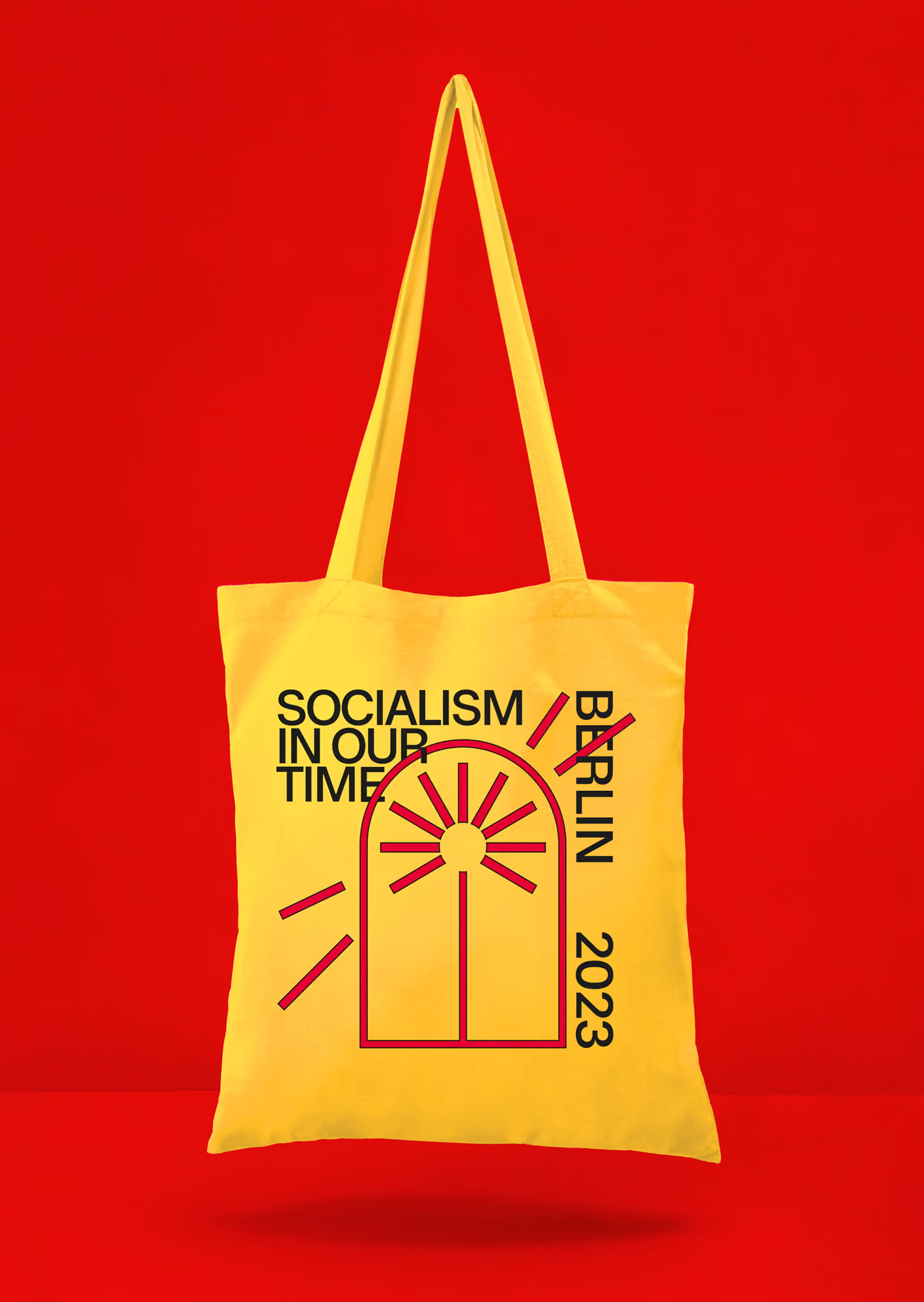

Besides the magazine itself, we twice hosted a conference titled "Socialism in Our Time", inviting political and intellectual figures from across the left in Germany and abroad. As an additional source of income, we sold art prints and posters.
In the fourth year, JACOBIN’s US mothership overhauled its own visual identity, and I provided typographic consulting for the redesign. Around the same time, we decided to rebuild the print magazine once more, changing its format. I developed a complex new layout template that made the publication more consistent as a whole while preserving its creative spirit.
Even in the middle of this ambitious undertaking, I had begun to think about leaving. Four exciting, exhausting years of largely pro bono work alongside my commercial jobs had been enough, and with the birth of our first daughter I needed to step back. I have always seen JACOBIN as activism, not something I do primarily for money. A salaried position at our own publishing house was not an option for me, because I keep commercial interests and activism separate. So at the beginning of 2024, with a light heart, I sold my shares in the company and handed the role of Creative Director to Andy King, the team’s first employed designer. Since then the magazine has continued to thrive, with beautifully designed print issues, a full website relaunch and its own community app.